
Context
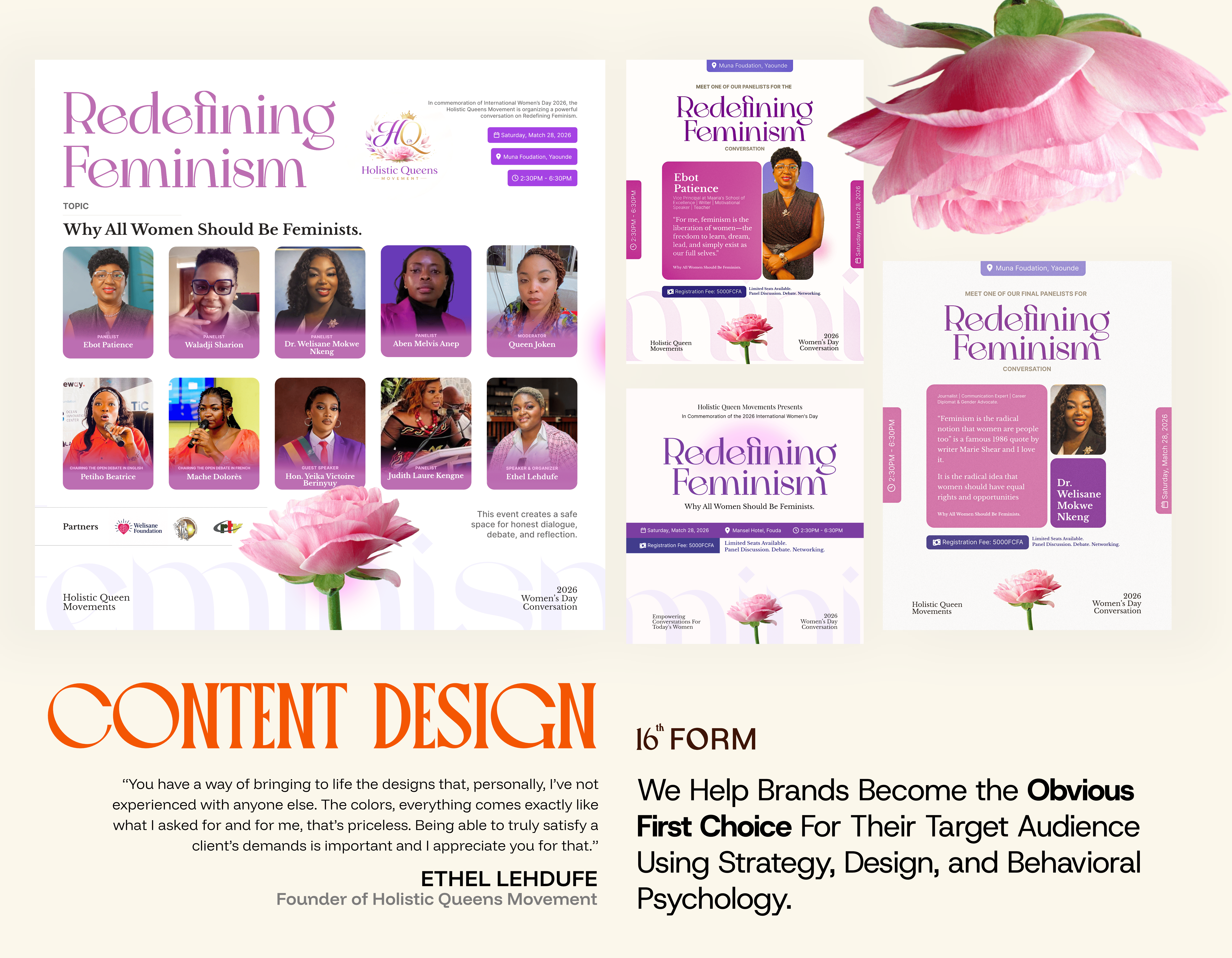
The event required a content system that could carry both philosophy and clarity.
Messages needed to feel personal while still holding structure across multiple formats.
Design Direction
The direction focused on translating feminine expression into visual language without losing readability.
Key choices:
- Soft but controlled typography contrast
- A palette built around layered purples and pinks
- Imagery that reflects natural form rather than rigid structure
Typography System
The type system was built to separate roles clearly:
- A serif for expressive, defining statements
- A classic serif for longer philosophical text
- A neutral sans-serif for functional clarity
This allowed content to shift between emotion and structure without confusion.
Color Logic
The palette was applied with restraint to maintain balance across layouts.
- Multiple shades worked together instead of competing
- No single color dominated the composition
- Visual weight was distributed to guide attention naturally
Content Approach
Each piece of content followed a simple rule:
Make the message easy to read, then make it feel intentional.
This was executed through:
- Short, structured text blocks
- Clear hierarchy between headline, body, and supporting details
- Consistent spacing to avoid visual noise
Visual Language
Imagery supported the theme without overpowering the message.
- Organic shapes over sharp geometry
- Soft gradients and natural textures
- Symbolic elements tied to growth and presence
Outcome
The content reads consistently across formats and maintains a clear visual identity.
Each piece supports the same tone, structure, and visual rhythm without relying on heavy styling.